
Tailwind has well over a hundred typography classes, but a small set of them does most of the work. These are the twenty we’d reach for first, grouped by job, with live demos and real sites from the Typ.io library that use each technique.
Everything here is Tailwind CSS v4. Most of it works in v3 too. Typ.io keeps the computed styles of every sample, so where a card appears below, that site really does what the item describes.
Fonts and weights
1. font-sans, font-serif, font-mono, and your own
The three built-in families are sensible system stacks. Add your own fonts as theme variables and Tailwind creates a class for each one:
@import "tailwindcss";

@theme {
  --font-display: "Oswald", sans-serif;
  --font-body: "Open Sans", sans-serif;
}
<h1 class="font-display">Big and condensed</h1>
<p class="font-body">Calm and readable.</p>
Naming fonts by job (display, body) instead of by name means you can change a pairing in one place.
2. font-medium and font-semibold
font-bold (700) is often too heavy, especially for large headings and on dark backgrounds. font-medium (500) and font-semibold (600) give you emphasis without the shouting. Check that you’ve actually loaded those weights, or the browser will fake them.
Big headings at medium and semibold weights: Futura PT at 500 and Druk at 500, both set large.

3. italic and not-italic
not-italic is the one to remember: it cancels italics that come from elsewhere, like the browser’s default for <em>, <cite> or <address>. If your font has no real italic, the browser slants the regular one instead. That fake version looks noticeably worse, so load the italic or avoid it.
4. font-features-[…]: turn on OpenType features
Many fonts hide alternate letterforms, ligatures and number styles behind OpenType features. Turn them on for one element, or for every use of a font:
<h1 class="font-display font-features-['ss01']">Alternate letters</h1>
@theme {
  --font-display: "Oswald", sans-serif;
  --font-display--font-feature-settings: "ss01";
}
Which features exist depends on the font, so look them up on its specimen page.
Size and spacing
5. text-lg/7: size and line height in one class
Put a slash after any size class to set the line height at the same time. text-lg/7 means 18px text on a 28px line. Every size class also comes with a sensible default line height, so use the slash when you want to override it.
<p class="text-lg/7">Readable body copy.</p>
Body text at 18px on 28–30px lines, which is text-lg/7 or a touch more: Proxima Nova and Ovo.


6. leading-*
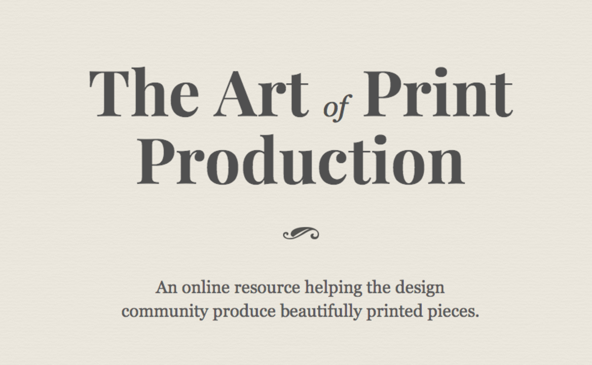
leading-tight (1.25) for headings, leading-relaxed (1.625) for long paragraphs. Big text needs less line height than small text, so tighten as you scale up. Plenty of sites go all the way to leading-none for display sizes:
Brandon Grotesque at 75px on a 75px line, and Playfair Display at 88px on just 72px.

7. tracking-tight on big headings
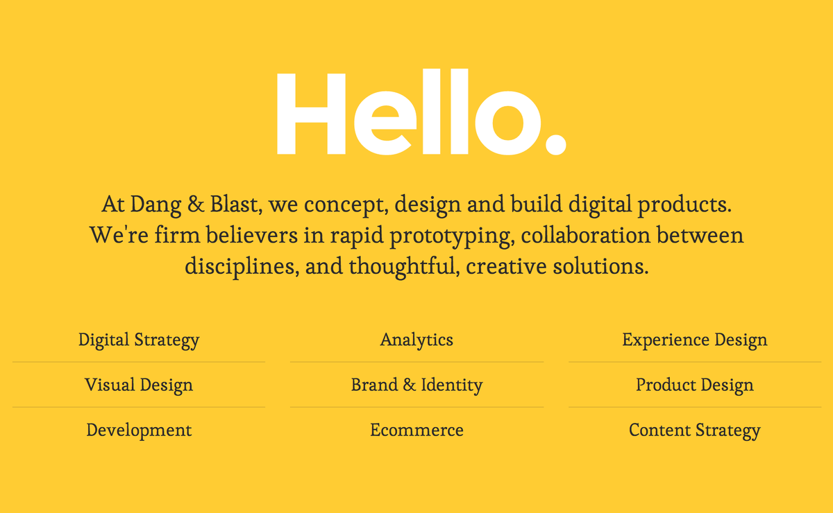
Letter spacing that looks fine at 16px looks loose at 64px. tracking-tight (-0.025em) or tracking-tighter (-0.05em) pulls large headings together. Leave body text alone.
<h1 class="text-6xl font-semibold tracking-tight">Tighter at size</h1>
Montserrat at 130px with exactly tracking-tighter (-6.5px), and Minion at 144px pulled in by 4px.

8. Responsive and fluid sizes
Either step the size at breakpoints, or let it scale smoothly with the viewport:
<h1 class="text-3xl md:text-5xl lg:text-6xl">Stepped</h1>
<h1 class="text-[clamp(2rem,5vw,3.5rem)]">Fluid</h1>
The fluid version never goes below 2rem or above 3.5rem.
9. The eyebrow: uppercase tracking-widest text-xs
The small label above a heading. Capitals need extra letter spacing to be readable, so uppercase should almost always come with a tracking-* class. It’s a common miss: of the 2,200 all-caps text styles we’ve captured from real sites, 928 (42%) have no extra letter spacing at all.
<p class="text-xs font-semibold uppercase tracking-widest">Case study</p>
<h2 class="text-4xl">How we rebuilt the checkout</h2>
Small capitals done right: Brandon Grotesque at 12px with 2px of tracking, and Museo Slab at 12px with 3px.


Line length and wrapping
10. max-w-prose
Sets a maximum width of 65ch: roughly 65 characters per line, often a few more, since ch is the width of the font’s zero. Line length has a bigger effect on readability than almost any other setting, and this class sorts it in one go.
<article class="max-w-prose">…</article>
Body text in columns of 570–640px, right around max-w-prose: Proxima Nova and Freight Text.

11. text-balance for headings
Spreads the words evenly across lines, so a two-line heading doesn’t end with one lonely word. The browser only balances short blocks of text, so it’s for headings, not paragraphs.
Default
Pairings we keep using
text-balance
Pairings we keep using
12. text-pretty for paragraphs
Asks the browser to avoid a single word on the last line of a paragraph. It’s cheap and safe to put on all body text.
<h2 class="text-balance">A heading that wraps nicely on every screen</h2>
<p class="text-pretty">Body text without orphans…</p>
It’s new enough that few sites in the library use it yet. These two do: one uses text-balance, the other both text-balance and text-pretty.


13. truncate
Cuts one line of text short with an ellipsis. It combines overflow: hidden, white-space: nowrap and text-overflow: ellipsis. The element needs a width, so inside flexbox you may also need min-w-0 on the element.
Two sites that truncate with an ellipsis:


14. line-clamp-3
The same thing for several lines: three lines, then an ellipsis. Good for card descriptions.
Default
A long card description that someone wrote for the CMS without knowing how much room there would be. It keeps going, pushing the card taller than its neighbours and breaking the grid.
line-clamp-3
A long card description that someone wrote for the CMS without knowing how much room there would be. It keeps going, pushing the card taller than its neighbours and breaking the grid.
15. hyphens-auto
Lets the browser hyphenate long words, which matters most in narrow columns. It only works if the page declares its language, for example <html lang="en">. For long URLs, wrap-break-word is the better tool.
Two sites that hyphenate their text automatically:

The details
16. tabular-nums
Makes every digit the same width, so numbers line up in tables, prices and counters, and don’t jiggle as they change.
<td class="text-right tabular-nums">$1,204.50</td>
Two sites that switch to tabular figures:


17. underline-offset-4 decoration-2
The browser’s default underline sits tight against the letters and cuts through descenders. Move it down and set its thickness, and links look designed:
<a class="underline underline-offset-4 decoration-2 decoration-sky-500">Read more</a>
underlineTypography, quietly
underline-offset-4 decoration-2Typography, quietly
18. Text colour with opacity: text-gray-950/70
Pure black on white is harsh for long text. A near-black at reduced opacity is softer, and it adapts to whatever background it’s on. Check the contrast: body text needs at least 4.5:1.
19. antialiased
Makes text look thinner and crisper on macOS, which is especially noticeable for light text on dark backgrounds. It has no effect on most other systems. It’s so common that 56% of the text styles we’ve captured from real sites use it; most put it on <body> and forget about it.
20. first-letter:: drop caps with no extra markup
<p class="first-letter:float-left first-letter:mr-2 first-letter:text-6xl first-letter:font-bold">
  Once upon a time…
</p>
For a drop cap that lines up exactly with the text, see initial-letter in our CSS typography features guide.
One more: prose
If your content comes from Markdown or a CMS, you can’t put classes on every paragraph. The official @tailwindcss/typography plugin styles all of it with one class, and you can tune it with modifiers such as prose-lg or prose-headings:font-display:
@plugin "@tailwindcss/typography";
<article class="prose lg:prose-lg">…</article>