
Good web typography is mostly a matter of getting twenty small decisions right. None of these rules is clever on its own, but together they’re the difference between text people read and text people skim. Here they are in plain CSS, with live demos and real sites from the Typ.io library that follow them.
Typ.io keeps the computed styles of every sample, so where a card appears below, that site really does what the rule says. Looking for something newer? See 7 CSS typography features you didn’t know existed.
Loading fonts
1. Always write a full font stack
List your web font, then a similar local font, then a generic family. If the web font fails or is slow, readers get something close instead of the browser default.
body {
  font-family: "Source Serif 4", Georgia, "Times New Roman", serif;
}
Typ.io records the stack behind every font it finds. This site falls back from FF Meta Serif through Georgia, Cambria and Times; the second pairs each of its fonts with a fallback of the same kind.

2. Choose a font-display
font-display decides what happens while a web font loads. swap shows the fallback immediately and swaps when the font arrives, which is right for body text. optional uses the web font only if it arrives almost instantly, so the page never jumps.
@font-face {
  font-family: "Source Serif 4";
  src: url("/fonts/source-serif-4.woff2") format("woff2");
  font-display: swap;
}
3. Preload the one font you need first
The browser doesn’t discover fonts until it has read your CSS. Preloading your main body font starts the download straight away. Preload one or two files at most, or they’ll compete with everything else.
<link rel="preload" href="/fonts/source-serif-4.woff2" as="font" type="font/woff2" crossorigin>
The crossorigin attribute is required even for fonts on your own domain; without it the font is downloaded twice.
4. Use variable fonts for multiple weights
One variable font file can replace a whole folder of weights. Declare the range in @font-face and you can use any weight in between, not only the multiples of 100:
@font-face {
  font-family: "Inter";
  src: url("/fonts/inter-variable.woff2") format("woff2");
  font-weight: 100 900;
}

h1 { font-weight: 650; }
Sites using in-between weights: Overused Grotesk at 420 and 550, and GT Sectra Fine at 350.


5. Leave optical sizing on
Some variable fonts have an optical size axis (opsz) that adjusts the design for the size it’s shown at: sturdier letters for captions, finer detail for headlines. Browsers apply it automatically (font-optical-sizing: auto), so don’t switch it off, and make sure the font you load actually includes the axis. On Google Fonts that means requesting opsz in the URL.
Size and spacing
6. Prefer rem to px for text
Readers can set a larger default text size in their browser. rem respects that setting and px ignores it. 1rem is 16px by default.
body { font-size: 1.125rem; } /* 18px by default */
7. Use a type scale
Pick a ratio and derive every size from it, instead of choosing sizes one by one. Custom properties keep it in one place:
:root {
  --step-0: 1rem;
  --step-1: calc(var(--step-0) * 1.25);
  --step-2: calc(var(--step-1) * 1.25);
  --step-3: calc(var(--step-2) * 1.25);
}

h3 { font-size: var(--step-1); }
h2 { font-size: var(--step-2); }
h1 { font-size: var(--step-3); }
8. Make headings fluid with clamp()
clamp(minimum, preferred, maximum) lets a heading grow with the viewport between two limits, with no breakpoints:
h1 { font-size: clamp(2rem, 1rem + 4vw, 3.5rem); }
Mixing a rem value into the middle term keeps the text zoomable.
9. Write line-height without units
A unitless line height is inherited as a ratio, so every element works it out from its own font size. With em or px, children inherit a fixed height, and large headings end up with overlapping lines.
body { line-height: 1.6; }
h1, h2 { line-height: 1.15; }
line-height: 1.5em
A heading that wraps
line-height: 1.5
A heading that wraps
1.5em they inherit a fixed 21px, far too little for 28px text. Unitless, they get 1.5 times their own size.10. Set letter-spacing in em
Letter spacing in em scales with the font size, so one value works at every size. Big headings usually want slightly less space (around -0.02em); small capitals want more.
h1 { letter-spacing: -0.02em; }
Large headings with tightened spacing: Gilroy at 72px with exactly -0.02em, and Raleway at 64px.


Readable text
11. Keep lines 45–75 characters long
Line length has a bigger effect on readability than almost any other setting. The ch unit is the width of the font’s zero, a little wider than the average letter, so 65ch fits roughly 65 characters, often a few more:
article { max-width: 65ch; }
Body text at 18–20px in columns of about 630px, comfortably inside the range: Roboto Slab and FF Tisa.


12. Balance your headings
text-wrap: balance evens out line lengths, so a heading never ends with one stranded word. It works in every current browser, and only on short blocks, so use it for headings.
h1, h2, h3 { text-wrap: balance; }
13. Avoid orphans in paragraphs
text-wrap: pretty asks the browser to avoid leaving a single word on a paragraph’s last line. It works in Chrome, Edge and Safari; Firefox ignores it, so it’s safe to add now.
p { text-wrap: pretty; }
Two sites already using these: one balances its headings, the other uses pretty.


14. Hyphenate narrow columns
hyphens: auto breaks long words at the right places, which evens out ragged edges in narrow columns. It only works if the page declares its language.
<html lang="en">
.sidebar p { hyphens: auto; }
Two sites with automatic hyphenation switched on:


15. Stop long words and URLs breaking the layout
A long URL can push a phone layout wider than the screen. overflow-wrap: anywhere lets the browser break it wherever it has to:
.article { overflow-wrap: anywhere; }
Default
Read it at https://example.com/unsubscribe?token=8f3a9c2e7b1d4f6a0c5e9b3d7f1a2c4e
overflow-wrap: anywhere
Read it at https://example.com/unsubscribe?token=8f3a9c2e7b1d4f6a0c5e9b3d7f1a2c4e
16. Get the contrast right
Body text needs a contrast ratio of at least 4.5:1 with its background; large text (24px, or about 19px bold) needs 3:1. Softening pure black to a very dark grey is fine; pale grey body text is not.
body {
  color: #1f2328;
  background: #ffffff;
}
#999999 · 2.7:1
Pale grey looks refined in a mockup and is a struggle to read on a phone in daylight.
#1f2328 · 15:1
A very dark grey is softer than black and easy to read anywhere.
The details
17. Use the right kind of numbers
font-variant-numeric switches between the number styles a font includes. Tabular numbers line up in tables; old-style numbers sit better in running text.
table { font-variant-numeric: tabular-nums; }
.prose { font-variant-numeric: oldstyle-nums; }
.recipe { font-variant-numeric: diagonal-fractions; }
Sites that choose their number style: Jannon with old-style numbers, and Camphor with proportional ones.


18. Prefer font-variant-* to font-feature-settings
Both turn on OpenType features, but font-feature-settings is all-or-nothing: setting it on a child element replaces every feature the parent set. The font-variant-* properties combine properly. Keep font-feature-settings for features that have no font-variant equivalent, like stylistic sets.
body { font-variant-ligatures: common-ligatures; }
.logo { font-feature-settings: "ss01"; }
Sites that set ligatures with font-variant-ligatures: the first turns on discretionary ligatures for Abril Fatface.
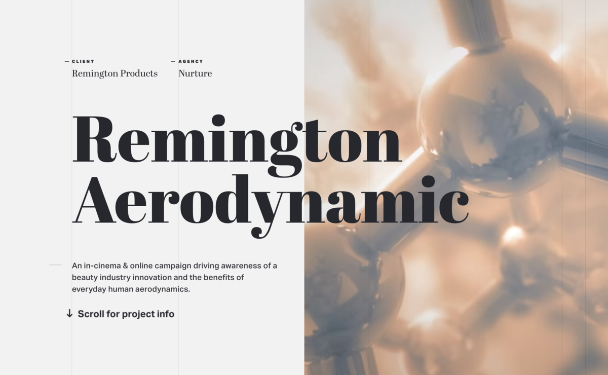

19. Space out capitals, and write them in normal case
Text in capitals needs extra letter spacing to be readable. Write the words normally in your HTML and uppercase them in CSS, so screen readers don’t spell them out letter by letter and copied text isn’t shouting.
.label {
  text-transform: uppercase;
  letter-spacing: 0.08em;
  font-size: 0.75rem;
}
This is the rule sites break most often: of the 2,200 all-caps text styles we’ve captured, 928 (42%) have no extra letter spacing. These two get it right, both at 11–14px with 2px of spacing:


20. Style your underlines
The default underline sits tight against the letters. Move it down, set its thickness, and give it its own colour:
a {
  text-decoration-thickness: 0.08em;
  text-underline-offset: 0.2em;
  text-decoration-color: color-mix(in srgb, currentColor 40%, transparent);
}
DefaultTypography, quietly
StyledTypography, quietly